


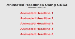
Animated Headlines Using CSS3
Last Updated : Jul 1, 2023
In this tutorial we will create some different beautiful animated headlines using CSS3, Headlines are very important part of any web page because it is one of the most useful factor to attract visitor to your webpage so headlines should be fancy and appealing to get more attraction.
You may also like Animated Navigation Menu Using CSS And HTML

CHECK OUT THIS TUTORIAL LIVE DEMO →
To Create Animated Headlines it takes only two step:-
- Make a HTML file and define markup
- Make a CSS file and define styling
Step 1. Make a HTML file and define markup
We make a HTML file and save it with a name headlines.html
<html>
<head>
<link rel="stylesheet" type="text/css" href="headlines_style.css">
</head>
<body>
<div id="wrapper">
<p class='head1'>Animated Headline 1</p>
<p class='head2'>Animated Headline 2</p>
<p class='head3'>Animated Headline 3</p>
<p class='head4'>Animated Headline 4</p>
<p class='head5'>Animated Headline 5</p>
</div>
</body>
</html>
In this step we create 5 headline to show you the different fancy styling and attach our headline style file. You may also like css3 blink text effect.
Step 2. Make a CSS file and define styling
We make a CSS file and save it with a name headlines_style.css
body
{
 margin:0px; auto;
 padding:0px;
 font-family:helvetica;
 background-color:#E6E6E6;
}
#wrapper
{
 width:995px;
 padding:0px;
 margin:0px auto;
 font-family:helvetica;
 text-align:center;
}
p
{
 font-weight:bold;
 font-size:30px;
 margin-top:30px;
 color:red;
}
.head1
{
 -webkit-animation: head1_animate 1s infinite;
 -moz-animation: head1_animate 1s infinite;
 animation: head1_animate 1s infinite;
}
@-webkit-keyframes head1_animate {
 0%{-webkit-transform: scale(1.0);}
 40% {-webkit-transform: scale(1.11);}
 80%{-webkit-transform: scale(1.12);}
 100%{-webkit-transform: scale(1);}
}
@-moz-keyframes head1_animate {
 0%{-moz-transform: scale(1.0);}
 40% {-moz-transform: scale(1.11);}
 80%{-moz-transform: scale(1.12);}
 100%{-moz-transform: scale(1);}
}
@keyframes head1_animate {
 0%{transform: scale(1.0);}
 40% {transform: scale(1.11);}
 80%{transform: scale(1.12);}
 100%{transform: scale(1);}
}

.head2
{
 -webkit-animation: head2_animate 2s infinite;
 -moz-animation: head2_animate 2s infinite;
 animation: head2_animate 2s infinite;
}
@-webkit-keyframes head2_animate {
 0%, 20%, 50%, 80%, 100% {-webkit-transform: translateY(0);}
 40% {-webkit-transform: translateY(-30px);}
 60% {-webkit-transform: translateY(-15px);}
}
@-moz-keyframes head2_animate {
 0%, 20%, 50%, 80%, 100% {-moz-transform: translateY(0);}
 40% {-moz-transform: translateY(-30px);}
 60% {-moz-transform: translateY(-15px);}
}
@keyframes head2_animate {
 0%, 20%, 50%, 80%, 100% {transform: translateY(0);}
 40% {transform: translateY(-30px);}
 60% {transform: translateY(-15px);}
}

.head3
{
 -webkit-animation: head3_animate 0.5s infinite;
 -moz-animation: head3_animate 0.5s infinite;
 animation: head3_animate 0.5s infinite;
}
@-webkit-keyframes head3_animate {
 0%{-webkit-transform: rotate(0deg);}
 20%{-webkit-transform: rotate(10deg);}
 60%{-webkit-transform: rotate(0deg);}
 80%{-webkit-transform: rotate(-10deg);}
 100%{-webkit-transform: rotate(0deg);}
}
@-moz-keyframes head3_animate {
 0%{-moz-transform: rotate(0deg);}
 20%{-moz-transform: rotate(10deg);}
 60%{-moz-transform: rotate(0deg);}
 80%{-moz-transform: rotate(-10deg);}
 100%{-moz-transform: rotate(0deg);}
}
@keyframes head3_animate {
 0%{transform: rotate(0deg);}
 20%{transform: rotate(10deg);}
 60%{transform: rotate(0deg);}
 80%{transform: rotate(-10deg);}
 100%{transform: rotate(0deg);}
}

.head4
{
 -webkit-animation: head4_animate 2s infinite;
 -moz-animation: head4_animate 2s infinite;
 animation: head4_animate 2s infinite;
}
@-webkit-keyframes head4_animate {
 0%{-webkit-transform: translateX(100px);}
 50%{-webkit-transform: translateX(0px);}
}
@-moz-keyframes head4_animate {
 0%{-moz-transform: translateX(100px);}
 50%{-moz-transform: translateX(0px);}
}
@keyframes head4_animate {
 0%{transform: translateX(100px);}
 50%{transform: translateX(0px);}
}

.head5
{
 -webkit-animation: head5_animate 2s infinite;
 -moz-animation: head5_animate 2s infinite;
 animation: head5_animate 2s infinite;
}
@-webkit-keyframes head5_animate {
 20%{color:green;}
 40%{color:yellow;}
 60%{color:blue;}
 80%{color:pink;}
 100%{color:orange;}
}
@-moz-keyframes head5_animate {
 20%{color:green;}
 40%{color:yellow;}
 60%{color:blue;}
 80%{color:pink;}
 100%{color:orange;}
}
@keyframes head5_animate {
 20%{color:green;}
 40%{color:yellow;}
 60%{color:blue;}
 80%{color:pink;}
 100%{color:orange;}
}
In this step we use many CSS3 property such as animation, keyframes, transform etc to know more about
check CSS3 Animations to achieve different styling.
In this step we majorly use keyframes property of CSS3 to give styling in different percentage of time. You may also like Animated Login and SignUp Form With Flip Animation using CSS3
Thats all, this is how to Create Animated Headlines Using CSS3. You can customize this code further as per your requirement. And please feel free to give comments on this tutorial.
I hope this tutorial on heading animation css helps you and the steps and method mentioned above are easy to follow and implement.
 About Dikshita
Passionate Electronics and Communication Engineering student with expertise in web development (HTML, CSS, JS,PHP, Bootstrap, React.js) and content writing. Eager problem solver and tech enthusiast, adept at creating engaging web experiences.
RELATED TUTORIALS
 Animated Headlines Using CSS3
 Create Animated Background Using CSS3
 Animated Loading Spinners Using CSS3
 Create Fancy Animated Buttons Using CSS3
 Animated Login and SignUp Form With Flip Animation using CSS3 and jQuery
 Animated Progress Bar Using jQuery And CSS
 Animated Navigation Menu Using CSS And HTML
 Create Animated Skill Bar Using jQuery, HTML And CSS
 Create Simple Tooltip Using CSS3
 Change Background With Animation Using CSS3