Animated Loading Spinners Using CSS3
Last Updated : Jul 1, 2023
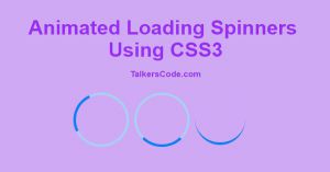
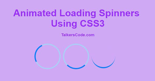
In this tutorial we will show you how to create simple animated loading spinners using CSS3, Loading Spinners are the moving object of different shapes and sizes which are used as an indicator in processing or in loading data in a website.
You may also like CSS3 animated headlines.
CHECK OUT THIS TUTORIAL LIVE DEMO →
To Create Loading Spinners It Takes Only One Step:-
- Make a HTML file and define markup and styling
Step 1. Make a HTML file and define markup and styling
We make a HTML file and save it with a name spinners.html
<html>
<head>
<style>
.spinner1
{
 width: 100px;
 height: 100px;
 border-radius: 50%;
 border: 5px solid #A9D0F5;
 border-top-color: #0080FF;
 animation: spinner1 .9s ease infinite;
}
@keyframes spinner1
{
 to {transform: rotate(360deg);}
}

.spinner2
{
 margin-left:10px;
 width: 100px;
 height: 100px;
 border-radius: 50%;
 border: 5px solid #A9D0F5;
 border-top-color: #0080FF;
 animation: spinner2 .9s linear infinite;
}
@keyframes spinner2
{
 to {transform: rotate(360deg);}
}

.spinner3
{
 margin-left:10px;
 width: 100px;
 height: 100px;
 border-radius: 50%;
 border-top:5px solid #0080FF;
 border-bottom: 1px solid white;
 animation: spinner3 .9s linear infinite;
}
@keyframes spinner3
{
 to {transform: rotate(360deg);}
}
div
{
 float:left;
}
</style>
</head>
<body>
<div class="spinner1"></div>
<div class="spinner2"></div>
<div class="spinner3"></div>
</body>
</html>
In this step we create three div for three different loading spinners and then we use CSS3 animation and keyframes to create an animated effect for loading spinners. You may also like CSS3 fancy animated buttons.
Thats all, this is how to create animated loading spinners using CSS3.You can customize this code further as per your requirement. And please feel free to give comments on this tutorial.
I hope this tutorial on loading spinner css helps you and the steps and method mentioned above are easy to follow and implement.


