


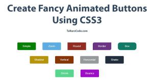
Create Fancy Animated Buttons Using CSS3
Last Updated : Jul 1, 2023
In this tutorial we will show you how to create fancy animated buttons using CSS3. We will create round buttons, shrinking buttons, bouncy buttons, expanding buttons, zoom buttons, shaking buttons etc you can use any button in your website easily without any external dependency.
You may also like CSS3 animated headlines.

CHECK OUT THIS TUTORIAL LIVE DEMO →
To Create Fancy Animated Buttons It Takes Only Two Steps:-
- Make a HTML file and define markup
- Make a CSS file and define styling
Step 1. Make a HTML file and define markup
We make a HTML file and save it with a name buttons.html
<html>
<head>
<link href="buttons_style.css" type="text/css" rel="stylesheet"/>
</head>
<body>
<div id="wrapper">

<div id="button_div">
 <input type="button" class="simple" value="Simple">
 <input type="button" class="zoom" value="Zoom">
 <input type="button" class="round" value="Round">
 <input type="button" class="border" value="Border">
 <input type="button" class="box" value="Box">
 <br>
 <input type="button" class="shadow" value="Shadow">
 <input type="button" class="vertical" value="Vertical">
 <input type="button" class="horizontal" value="Horizontal">
 <input type="button" class="shake" value="Shake">
 <br>
 <input type="button" class="shrink" value="Shrink">
 <input type="button" class="bounce" value="Bounce">
</div>

</div>
</body>
</html>
In this step we create 11 buttons to display 11 different type of animated buttons we add our 'buttons_style.css' file which we were going to create in next step.
You may also like animated loading spinners using CSS3.
Step 2. Make a CSS file and define styling
We make a CSS file and save it with a name buttons_style.css
body
{
 margin:0 auto;
 padding:0px;
 text-align:center;
 width:100%;
 font-family: "Myriad Pro","Helvetica Neue",Helvetica,Arial,Sans-Serif;
}
#wrapper
{
 margin:0 auto;
 padding:0px;
 text-align:center;
width:995px;
}
#wrapper h1
{
 margin-top:50px;
 font-size:45px;
 color:#34495E;
}
#wrapper h1 p
{
font-size:18px;
}
#button_div input[type="button"]
{
 background-color:none;
 width:120px;
 height:50px;
 margin:20px;
 font-size:17px;
 color:white;
 border:none;
}
#button_div .simple
{
 background-color:green;
 border: 1px solid green;
 transition: all 0.35s ease;
 border-radius:5px;
}
#button_div .simple:hover
{
 border: 1px solid green;
 background-color:white;
 color:green;
}
#button_div .zoom
{
 background-color:#5DADE2;
 transition: all 0.35s ease;
 border-radius:5px;
}
#button_div .zoom:hover
{
 border: 1px solid #5DADE2;
 background-color:white;
 color:#5DADE2;
 transform: scale(1.2);
}
#button_div .round
{
 background-color:#922B21;
 transition: all 0.35s ease;
}
#button_div .round:hover
{
 border: 1px solid #922B21;
 background-color:white;
 color:#922B21;
 border-radius:15px;
}
#button_div .border
{
 background-color:#6C3483;
 transition: all 0.35s ease;
 border-radius:10px 0px 10px 0px;
}
#button_div .border:hover
{
 border: 1px solid #6C3483;
 background-color:white;
 color:#6C3483;
 border-radius:0px 10px 0px 10px;
}
#button_div .box
{
 background-color:#117A65;
 transition: all 0.35s ease;
 border-radius:15px;
}
#button_div .box:hover
{
 border: 1px solid #117A65;
 background-color:white;
 color:#117A65;
 border-radius:0px;
}
#button_div .shadow
{
 background-color:#B7950B;
 transition: all 0.35s ease;
 border-radius:5px;
}
#button_div .shadow:hover
{
 border: 1px solid #B7950B;
 background-color:white;
 color:#B7950B;
 box-shadow:0px 0px 25px 0px #B7950B;
}
#button_div .vertical
{
 background-color:#873600;
 transition: all 0.35s ease;
 border-radius:5px;
}
#button_div .vertical:hover
{
 border: 1px solid #873600;
 background-color:white;
 color:#873600;
 animation: vertical .50s linear alternate;
}
@keyframes vertical
{
 20%{transform: translateY(0);}
 40% {transform: translateY(-10px);}
 60%{transform: translateY(0px);}
 80%{transform: translateY(15px);}
 100% {transform: translateY(0);}
}
#button_div .horizontal
{
 background-color:#979A9A;
 transition: all 0.35s ease;
 border-radius:5px;
}
#button_div .horizontal:hover
{
 border: 1px solid #979A9A;
 background-color:white;
 color:#979A9A;
 animation: horizontal .50s linear alternate;
}
@keyframes horizontal
{
 20%{transform: translateX(0);}
 40% {transform: translateX(-10px);}
 60%{transform: translateX(0px);}
 80%{transform: translateX(15px);}
 100% {transform: translateX(0);}
}
#button_div .shake
{
 background-color:#212F3C;
 transition: all 0.35s ease;
 border-radius:5px;
}
#button_div .shake:hover
{
 border: 1px solid #212F3C;
 background-color:white;
 color:#212F3C;
 animation: shake 0.005s 100 linear alternate;
}
@keyframes shake
{
 from{transform: rotate(2deg);}
 to{transform: rotate(-2deg);}
}
#button_div .shrink
{
 background-color:#58D68D;
 transition: all 0.35s ease;
 border-radius:5px;
}
#button_div .shrink:hover
{
 border: 1px solid #58D68D;
 background-color:white;
 color:#58D68D;
 transform: scale(0.9);
}
#button_div .bounce
{
 background-color:#9E0EC8;
 transition: all 0.35s ease;
 border-radius:5px;
}
#button_div .bounce:hover
{
 border: 1px solid #9E0EC8;
 background-color:white;
 color:#9E0EC8;
 animation: bounce 0.25s 2 linear alternate;
}
@keyframes bounce
{
 0%{transform: rotate(0deg);}
 50%{transform: rotate(3deg);}
 100%{transform: rotate(-3deg);}
}
In this step we define styling for 11 different buttons.We use some of the CSS3 properties like transform, transition, translate, animated and keyframes to give styling for these buttons.
You may also like animated navigation menu CSS.
That's all, this is how to create fancy animated buttons using CSS3. You can customize this code further as per your requirement. And please feel free to give comments on this tutorial.
I hope this tutorial on animated buttons CSS helps you and the steps and method mentioned above are easy to follow and implement.
 About Dikshita
Passionate Electronics and Communication Engineering student with expertise in web development (HTML, CSS, JS,PHP, Bootstrap, React.js) and content writing. Eager problem solver and tech enthusiast, adept at creating engaging web experiences.
RELATED TUTORIALS
 Create Fancy Animated Buttons Using CSS3
 Create Animated Background Using CSS3
 Animated Headlines Using CSS3
 Animated Loading Spinners Using CSS3
 Animated Login and SignUp Form With Flip Animation using CSS3 and jQuery
 Create Animated Skill Bar Using jQuery, HTML And CSS
 Add Social Media Buttons To Your Website Or Blog
 Create Simple Tooltip Using CSS3
 Animated Progress Bar Using jQuery And CSS
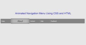 Animated Navigation Menu Using CSS And HTML