


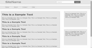
Simple And Best Responsive Web Design Using CSS Part 2
Last Updated : Jul 1, 2023
In this tutorial we will show you the solution of responsive web design using css, please Go to Next Page To See Step 1.Make a HTML file and define markups For Responsive Web Design

Step 2. Make a CSS file and define styling For Responsive Web Design
In this step we make a CSS file and save it with a name rwd_style.css and define style for our HTML page for devices screen sizes from width 360px to 1370px.
We use CSS Media Query to define styling for different screen sizes.You may also like responsive contact form.
This is the default style when our Web page is not viewed on our defined screen sizes.
body
{
 margin:0px;
 padding:0px;
 font-family:helvetica;
 width:100%;
 height:100%;
}
#header
{
 width:100%;
 height:65px;
 background-color:#E6E6E6;
 padding:10px;
 box-sizing:border-box;
 float:left;
 box-shadow:0px 0px 10px 0px #6E6E6E;
}
#header a
{
 margin:0px;
 padding:0px;
 margin-left:5%;
 font-size:45px;
 text-decoration:none;
 color:#6E6E6E;
 float:left;
}
#header #search
{
 margin:0px;
 padding:0px;
 border-radius:3px 0px 0px 3px;
 border:1px solid #BDBDBD;
 float:left;
 width:20%;
 height:80%;
 margin-left:40%;
 margin-top:5px;
 font-size:17px;
 padding:10px;
}
#header #submit
{
 margin-top:5px;
 background-color:#6E6E6E;
 border-radius:0px 3px 3px 0px;
 border:none;
 color:white;
 width:7%;
 height:80%;
 font-size:16px;
}
#navigation_bar
{
 clear:both;
 margin-top:3%;
 width:100%;
 height:45px;
 background-color:#E6E6E6;
 padding:10px;
 box-sizing:border-box;
 float:left;
 box-shadow:0px 0px 5px 0px #6E6E6E;
}
#navigation_bar a
{
 text-decoration:none;
 color:#6E6E6E;
 margin-left:5%;
 font-size:18px;
}
#left_column
{
 clear:both;
 float:left;
 margin-top:4%;
 margin-left:1%;
 padding:10px;
 box-sizing:border-box;
 background-color:#E6E6E6;
 width:65%;
 min-height:500px;
 box-shadow:0px 0px 1px 0px #6E6E6E;
 border:1px solid #D8D8D8;
 color:#424242;
 font-size:17px;
}
#right_column, #sec_right_column
{
 float:left;
 margin-top:4%;
 margin-left:5%;
 padding:10px;
 box-sizing:border-box;
 background-color:#E6E6E6;
 width:25%;
 min-height:250px;
 box-shadow:0px 0px 1px 0px #6E6E6E;
 border:1px solid #D8D8D8;
 color:#424242;
 font-size:17px;
}
#footer
{
 clear:both;
 margin-top:3%;
 width:100%;
 height:50px;
 background-color:#E6E6E6;
 padding:10px;
 box-sizing:border-box;
 float:left;
 box-shadow:0px 0px 5px 0px #6E6E6E;
}
#footer a
{
 margin:5%;
 text-decoration:none;
 color:#6E6E6E;
 font-size:18px;
}
This style is for screen size having minimum width of 1080px and maximum width of 1370px. You may also like full responsive table using css.
@media only screen and (min-width:1080px) and (max-width:1370px)
{
#header
{
 height:70px;
}
#header a
{
 font-size:50px;
}
#header #search
{
 width:20%;
 height:80%;
 margin-left:40%;
 margin-top:5px;
 font-size:18px;
}
#header #submit
{
 width:7%;
 height:80%;
 font-size:18px;
}
#navigation_bar a
{
 margin-left:5%;
 font-size:20px;
}
#left_column,#right_column,#sec_right_column
{
 font-size:19px;
}
#footer a
{
 font-size:20px;
}
}
This style is for screen size having minimum width of 960px and maximum width of 1079px.
@media only screen and (min-width:960px) and (max-width:1079px)
{
#header a
{
 margin-left:5%;
 font-size:40px;
}
#header #search
{
 width:20%;
 height:80%;
 margin-left:40%;
 margin-top:5px;
 font-size:15px;
}
#header #submit
{
 width:7%;
 height:80%;
 font-size:15px;
}
#navigation_bar a
{
 margin-left:5%;
 font-size:16px;
}
#footer a
{
 font-size:16px;
}
}
This style is for screen size having minimum width of 680px and maximum width of 959px.
@media only screen and (min-width:680px) and (max-width:959px)
{
#header a
{
 margin-left:5%;
 font-size:35px;
}
#header #search
{
 width:20%;
 height:80%;
 margin-left:40%;
 margin-top:5px;
 font-size:13px;
}
#header #submit
{
 width:8%;
 height:80%;
 font-size:13px;
}
#navigation_bar a
{
 margin-left:5%;
 font-size:16px;
}
#left_column,#right_column,#sec_right_column
{
 font-size:16px;
}
#footer a
{
 font-size:16px;
}
}
This style is for screen size having minimum width of 480px and maximum width of 679px.
@media only screen and (min-width:480px) and (max-width:679px)
{
#header
{
 height:55px;
}
#header a
{
 margin-left:5%;
 font-size:30px;
}
#header #search
{
 width:20%;
 height:70%;
 margin-left:35%;
 margin-top:5px;
 font-size:12px;
}
#header #submit
{
 width:10%;
 height:70%;
 font-size:12px;
}
#navigation_bar a
{
 margin-left:5%;
 font-size:15px;
}
#left_column,#right_column,#sec_right_column
{
 font-size:15px;
}
#footer
{
 height:35px;
}
#footer a
{
 font-size:15px;
}
}
This style is for screen size having minimum width of 360px and maximum width of 479px.
@media only screen and (min-width:360px) and (max-width:479px)
{
#header
{
 height:50px;
}
#header a
{
 margin-left:5%;
 font-size:25px;
}
#header #search
{
 width:20%;
 height:70%;
 margin-left:35%;
 margin-top:5px;
 font-size:11px;
}
#header #submit
{
 width:10%;
 height:70%;
 font-size:9px;
}
#navigation_bar a
{
 margin-left:5%;
 font-size:13px;
}
#left_column,#right_column,#sec_right_column
{
 font-size:13px;
}
#footer
{
 height:30px;
}
#footer a
{
 font-size:13px;
}
}
That's all, this is how to make a simple and best Responsive Web Design using CSS. You can customize this code further as per your requirement. And please feel free to give comments on this tutorial.
I hope this tutorial on responive web design using css helps you and the steps and method mentioned above are easy to follow and implement.
 About Anjali
Experienced Computer Programmer with a broad range of experience in technology. Strengths in application development and Object Oriented architecture design, front end programming, usability and multimedia technology. Expert in coding languages such as C, C++ Java, JavaScript, PHP and more.
RELATED TUTORIALS
 Simple And Best Responsive Web Design Using CSS Part 2
- Simple And Best Responsive Web Design Using CSS
 Create Simple Responsive Navigation Menu Using CSS
 Material Design Login Form Using jQuery And CSS
 Facebook Style Homepage Design Using HTML And CSS
 Change The Design Of All Elements In A WebPage Using JavaScript And CSS
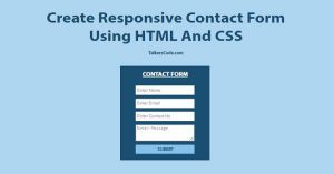 Create Responsive Contact Form Using HTML And CSS
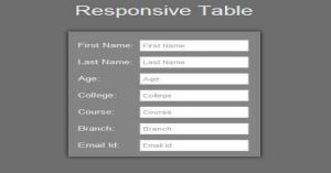 Create A Full Responsive Table Using HTML And CSS
 Responsive Login And Signup Form Using HTML And CSS
 Simple And Best Pagination With PHP, MySQL