


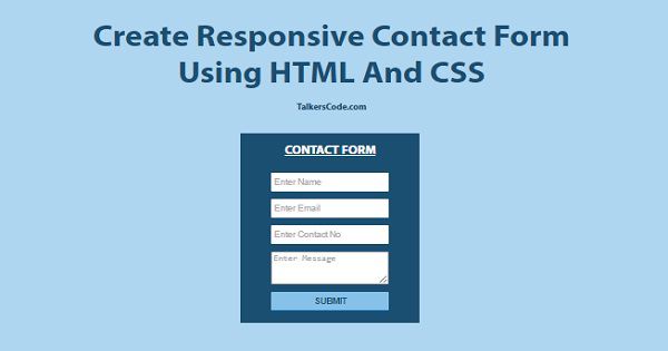
Create Responsive Contact Form Using HTML And CSS
Last Updated : Jul 1, 2023
In this tutorial we will show you how to create a responsive contact form using HTML and CSS. Responsive UI is always a better option instead of regular fixed width UI because there are now wide variety of screen size available and to create a fixed width webpage.
For every screen size is a no brainer you have to use responsive ui to make your webpage looks beautiful for almost every screen size. You may also like ajax contact form using PHP and MySQL.
CHECK OUT THIS TUTORIAL LIVE DEMO →
To Create Responsive Form It Takes Only Two Steps:-
- Make a HTML file and define markup
- Make a CSS file and define styling
Step 1. Make a HTML file and define markup
We make a HTML file and save it with a name contact_form.html
<html>
<head>
<meta name="viewport" content="width=device-width,initial-scale=1.0"/>
<link href="contact_form_style.css" type="text/css" rel="stylesheet"/>
</head>
<body>
<div id="wrapper">

<div id="contact_form_div">
 <p id="contact_label">CONTACT  FORM</p>
 <form method="post" action="">
  <p><input type="text" placeholder="Enter Name"></p>
  <p><input type="text" placeholder="Enter Email"></p>
  <p><input type="text" placeholder="Enter Contact No"></p>
  <p><textarea placeholder="Enter Message"></textarea></p>
  <p><input type="submit" value="SUBMIT"></p>
 </form>
</div>

</div>
</body>
</html>
In this step we create a contact form and add some text fields that almost every contact form
contains and add viewport meta tag to make our form responsive with proper css which we were going to create in next step.
You may also like validate form using jQuery.
Step 2. Make a CSS file and define styling
We make a CSS file and save it with a name contact_form_style.css
body
{
 margin:0 auto;
 padding:0px;
 text-align:center;
 width:100%;
 font-family: "Myriad Pro","Helvetica Neue",Helvetica,Arial,Sans-Serif;
 background-color:#AED6F1;
}
#wrapper
{
 margin:0 auto;
 padding:0px;
 text-align:center;
 width:995px;
}
#wrapper h1
{
 margin-top:50px;
 font-size:45px;
 color:#1B4F72;
}
#wrapper h1 p
{
 font-size:18px;
}
#contact_form_div
{
 width:330px;
 margin-left:320px;
 padding:10px;
 background-color:#1B4F72;
}
#contact_form_div #contact_label
{
 margin:15px;
 margin-bottom:30px;
 font-size:25px;
 font-weight:bold;
 color:white;
 text-decoration:underline;
}
#contact_form_div input[type="text"]
{
 width:230px;
 height:40px;
 border-radius:2px;
 font-size:17px;
 padding-left:5px;
 border:none;
}
#contact_form_div textarea
{
 width:230px;
 height:70px;
 border-radius:2px;
 font-size:17px;
 padding5px;
}
#contact_form_div input[type="submit"]
{
 width:230px;
 height:40px;
 border:none;
 border-radius:2px;
 font-size:17px;
 background-color:#85C1E9;
 border-bottom:3px solid #3498DB;
 color:#1B4F72;
 font-weight:bold;
}

@media only screen and (min-width:700px) and (max-width:995px)
{
 #wrapper
 {
  width:100%;
 }
 #wrapper h1
 {
  font-size:30px;
 }
 #contact_form_div
 {
  width:50%;
  margin-left:25%;
  padding-left:0px;
  padding-right:0px;
 }
 #contact_form_div input[type="text"]
 {
  width:80%;
 }
 #contact_form_div textarea
 {
  width:80%;
 }
 #contact_form_div input[type="submit"]
 {
  width:80%;
 }
}
@media only screen and (min-width:400px) and (max-width:699px)
{
 #wrapper
 {
  width:100%;
 }
 #wrapper h1
 {
  font-size:30px;
 }
 #contact_form_div
 {
  width:60%;
  margin-left:20%;
 }
 #contact_form_div input[type="text"]
 {
  width:80%;
 }
 #contact_form_div textarea
 {
  width:80%;
 }
 #contact_form_div input[type="submit"]
 {
  width:80%;
 }
}
@media only screen and (min-width:100px) and (max-width:399px)
{
 #wrapper
 {
  width:100%;
 }
 #wrapper h1
 {
  font-size:25px;
 }
 #contact_form_div
 {
  width:90%;
  margin-left:5%;
  padding-left:0px;
  padding-right:0px;
 }
 #contact_form_div input[type="text"]
 {
  width:80%;
 }
 #contact_form_div textarea
 {
  width:80%;
 }
 #contact_form_div input[type="submit"]
 {
  width:80%;
 }
}
In this step we use CSS3 Media Queries to make our contact form responsive. We use 3 different type of media query after simple fom styling.
In first media query we set styling for width between 700px to 995px all the styling we define under this media query will show on device with screen size between 700px to 995px same procedure we do in rest of the two media query.
We dont define complete styling again and again for every media query because we already set default styling before media queries.
You may also like responsive login and signup form.
That's all, this is how to create responsive contact form using HTML and CSS. You can customize this code further as per your requirement. And please feel free to give comments on this tutorial.
I hope this tutorial on responsive contact form helps you and the steps and method mentioned above are easy to follow and implement.
 About Riya
A recent graduate with a Bachelor of Technology (B.Tech) in Computer Science from India. She is passionate about leveraging technology to solve real-world problems. With a strong foundation and experience in programming languages such as Python, Django, HTML, CSS, and JavaScript, java, php and have honed her skills through hands-on projects and coursework.
RELATED TUTORIALS
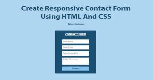 Create Responsive Contact Form Using HTML And CSS
 Responsive Login And Signup Form Using HTML And CSS
 Ajax Contact Form Using jQuery, PHP And MySQL
 Create A Full Responsive Table Using HTML And CSS
 Create Simple Responsive Navigation Menu Using CSS
 Create Newsletter SignUp Form Using jQuery And PHP
 Create Signup Form With Google reCAPTCHA Using PHP
 Create Dynamic Form Using PHP, jQuery And MySQL
 Create A Simple Login Form On Popup Box Using jQuery
 Easy Feedback Form On Page Bottom Using jQuery HTML And CSS