


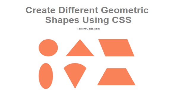
Create Different Geometric Shapes Using CSS
Last Updated : Jul 1, 2023
In this tutorial we will show you how to create different geometric shapes using CSS.Geometric shapes is used in mathematics to work in geometry.
CHECK OUT THIS TUTORIAL LIVE DEMO →
To Create Different Geometric Shapes It Takes Only Two Steps:-
- Make a HTML file and define markup for shapes
- Make a CSS file and define styling for shapes
Step 1. Make a HTML file and define markup for shapes
We make a HTML file and save it with a name shapes.html
<html>
<head>
 <link href="shapes.css"  rel="stylesheet" type="text/css" />
</head>
<body>
<div id="wrapper">
 <div id="shape_wrapper">
  <div id="circle" class="shape_div">
  </div>

  <div id="triangle" class="shape_div">
  </div>

  <div id="parallelogram" class="shape_div">
  </div>

  <br>

  <div id="oval" class="shape_div">
  </div>

  <div id="cone" class="shape_div">
  </div>

  <div id="trapezoid" class="shape_div">
  </div>
 </div>
</div>
</body>
</html>
In this step we create divs for different geometric shapes and insert shapes.css file which we were going to create in next step.
Step 2. Make a CSS file and define styling for shapes
We make a CSS file and save it with a name shapes.css
body
{
 text-align:center;
 width:100%;
 margin:0 auto;
 padding:0px;
 font-family:helvetica;
}
#wrapper
{
 text-align:center;
 margin:0 auto;
 padding:0px;
 width:995px;
}
h1
{
 margin-top:50px;
 color:grey;
 font-size:50px;
}
h1 p
{
 font-size:14px;
}
#shape_wrapper
{
 margin-left:220px;
}
.shape_div
{
 float:left;
 margin:20px;
}
#circle
{
 width: 100px;
 height: 100px;
 background: #FA8258;
 border-radius: 50px;
}
#triangle
{
 height: 0;
 width: 0;
 border-left: 75px solid transparent;
 border-right: 75px solid transparent;
 border-bottom: 100px solid #FA8258;
}
#parallelogram
{
 height: 100px;
 width: 150px;
 background: #FA8258;
 transform: skew(20deg);
}
#oval
{
 clear:both;
 float:left;
 height: 150px;
 width: 75px;
 background: #FA8258;
 border-radius: 50%;
}
#cone
{
 height: 0;
 width: 0;
 border-left: 75px solid transparent;
 border-right: 75px solid transparent;
 border-top: 150px solid #FA8258;
 border-radius: 50%;
}
#trapezoid
{
 height: 30;
 width: 100px;
 border-bottom: 100px solid #FA8258;
 border-left: 50px solid transparent;
 border-right: 50px solid transparent;
}
Thats all, this is how to create different geometric shapes using CSS. You can customize this code further as per your requirement. And please feel free to give comments on this tutorial.
I hope this tutorial on geometric shapes using CSS helps you and the steps and method mentioned above are easy to follow and implement.
 About Anjali
Experienced Computer Programmer with a broad range of experience in technology. Strengths in application development and Object Oriented architecture design, front end programming, usability and multimedia technology. Expert in coding languages such as C, C++ Java, JavaScript, PHP and more.
RELATED TUTORIALS
 Create Different Geometric Shapes Using CSS
 Create Short URL Using PHP
 Create XML Sitemap Using PHP
 Create RSS Feed Reader Using PHP
 Create RSS Feed For Website Using PHP
 Create Zip File After Upload Using PHP
 Create Vertical Timeline Using HTML And CSS
 Create Simple Web Crawler Using PHP And MySQL
 Create Sticky Header Using jQuery And CSS
 Create Your Own Custom Scrollbars Using CSS And HTML