


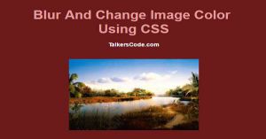
Blur And Change Image Color Using CSS3
Last Updated : Jul 1, 2023
In this tutorial we will show you how to blur and change the color and apply filter to image using CSS3. You may also like Image Zoom In On Hover Using CSS3

CHECK OUT THIS TUTORIAL LIVE DEMO →
To Blur And Change The Color Of Image It Takes Only Two Steps:-
- Make a HTML file and define markup
- Make a CSS file and define styling
Step 1. Make a HTML file and define markup
We make a HTML file and save it with a name change_color.html
<html>
<head>
<link rel="stylesheet" type="text/css" href="change_style.css">
</head>
<body>
<div id="wrapper">

<div id="img1_wrapper">
 <img src="images/image1.jpg" id="grey_img">
</div>
<div id="img2_wrapper">
 <img src="images/image2.jpg" id="white_img">
</div>
<div id="img3_wrapper">
 <img src="images/image3.jpg" id="blur_img">
</div>

</div>
</body>
</html>
In this step we use three images to show 3 different effects on images. You may also like Rotate And Flip Images Using CSS3
Step 2. Make a CSS file and define styling
We make a CSS file and save it with a name change_style.css
body
{
 width:100%;
 margin:0 auto;
 padding:0px;
 background-color:#6C1A1A;
 font-family:helvetica;
 text-align:center;
}
#wrapper
{
 text-align:center;
 margin:0 auto;
 padding:0px;
 width:995px;
}
h1
{
 margin-top:50px;
 color:#E39F9F;
}
h1 p
{
 font-size:14px;
 color:white;
}
#wrapper div
{
 width:300px;
 margin:30px;
}
#wrapper img
{
 width:100%;
}
#img1_wrapper:hover
{
 background-color: #A4A4A4;
}
#grey_img:hover
{
 -webkit-opacity: 0.4;
 -moz-opacity: 0.4;
 -o-opacity: 0.4;
 -ms-opacity: 0.4;
 opacity: 0.4;

 -webkit-filter: alpha(opacity=40);
 -moz-filter: alpha(opacity=40);
 -o-filter: alpha(opacity=40);
 -ms-filter: alpha(opacity=40);
 filter: alpha(opacity=40);
}
#img2_wrapper:hover
{
 background-color: #E6E6E6;
}
#white_img:hover
{
 -webkit-opacity: 0.4;
 -moz-opacity: 0.4;
 -o-opacity: 0.4;
 -ms-opacity: 0.4;
 opacity: 0.4;

 -webkit-filter: alpha(opacity=40);
 -moz-filter: alpha(opacity=40);
 -o-filter: alpha(opacity=40);
 -ms-filter: alpha(opacity=40);
 filter: alpha(opacity=40);
}
#blur_img:hover
{
 -webkit-filter: blur(4px);
 -moz-filter: blur(4px);
 -o-filter: blur(4px);
 -ms-filter: blur(4px);
 filter: blur(4px);
}
In this step we use CSS3 opacityto show different effects and then we use CSS3 filter property to change the color and blur the image.
Thats all, this is how to blur and change the color using CSS3. You can customize this code further as per your requirement.
And please feel free to give comments on this tutorial. You can use this trick to do the changes in YayMail also here is the YayMail review.
I hope this tutorial on blur and change the color using css helps you and the steps and method mentioned above are easy to follow and implement.
 About Ashish
Ashish is a dynamic and motivated individual with a passion of programming and an experienced programmer having 3+ years of experience in various languages like Java, Python, HTML, CSS, JavaScript, jQuery and various frameworks like Bootstrap
RELATED TUTORIALS
 Blur And Change Image Color Using CSS3
 Change Background With Animation Using CSS3
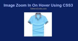 Image Zoom In On Hover Using CSS3
 Change The Design Of All Elements In A WebPage Using JavaScript And CSS
 Change The Content Of An Element After Certain Time Using jQuery,Ajax And PHP
 Change Browser URL Without Refreshing Page Using jQuery And HTML5
 Basic Image Gallery With Image Preview Using jQuery
 Display Preloading Image On Image Loading Using jQuery
 Animated Headlines Using CSS3
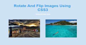 Rotate And Flip Images Using CSS3