


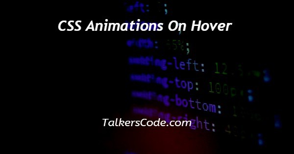
In this article we will show you the solution of CSS animations on hover, in CSS, adding animations make the web page more innovative and attractive.
We can apply animation in hover. When the user hovers the mouse in a box, image, etc. the animation works.
We can use animation related to the background color, opacity, etc. Suppose the user hovers the mouse in the box and the background color changes every second it indicates that we apply animation.
Step By Step Guide On CSS Animations On Hover :-
Apply animations on hover
<html>
<head>
  <title>Talkerscode</title>
  <style>
    .block{
      height:150px;
      width:150px;
      background-color: black;
    }
    .block:hover{
      width:300px;
      height:300px;
      animation: blink1 1s infinite;
      animation-delay: 2s;
    }
    @keyframes blink1{
      50% {background-color:red;}
      100% {background-color:yellow;}
      0%{ background-color: orange;}
    }
  </style>
</head>
<body>
  <div class="block"></div>
</body>
</html>
- Within the Style tag, we can assign a block class.
- Within the block class, we assign a height and width so that it represents a box-like structure.
- We assign a background color black initially when the user does not hover the mouse in the box it shows black color in the box.
- Then we can apply the hover effect in the block class.
- We assign the height and width when the user hovers the mouse in the box the height and width both increase as 300px
- We apply animation which means when the user hovers the mouse in the box the changements occur in 1 second as infinite times.
- We assign an animation delay of 2 seconds which means the changement occurs after 2 seconds.
- We already create keyframes named blink1, when the user hovers the mouse in the box the background color black changes into 50% red, 100% yellow, and 0% orange it blinks infinite times.
- Within the body tag, we assign a div class block.
Example 2
<html>
<head>
  <title>Talkerscode</title>
  <style>
    .block{
      background: url("demo.jpg");
      background-size:cover;
      height: 150px;
      width:150px;
    }
    .block:hover{
      width:300px;
      height:300px;
      animation: blink1 1s infinite;
      animation-delay: 2s;
    }
    @keyframes blink1{
      50% {opacity:0.2;}
      100% {opacity:1;}
    }
  </style>
</head>
<body>
  <div class="block"></div>
</body>
</html>
- In this example, we can apply the animation effect to the image.
- Within the Style tag, we can assign a block class.
- Within the block class, we can assign the URL of the background image.
- We can assign background-size as the cover it covers the image and set the height and width of the image.
- Then we can apply the hover effect in the block class.
- And we increase the height and width of the image when the user hovers the mouse in an image the size of the image increases.
- We apply animation in image which means when the user hovers the mouse in the image the changements occur in 1 second at infinite times.
- We assign an animation delay of 2 seconds which means the changement occurs after 2 seconds.
- We already create keyframes named blink1, when the user hovers the mouse in the box the opacity changes into 50% opacity as 0.2, 100% opacity as 1it blinks infinite times. Opacity ranges from 0 to 1 which means in opacity 0 the image is invisible and greater than 0 the image is visible.
Conclusion :-
In conclusion, we successfully learned how to apply the animation effect on hover.
We learned two code examples. In the first code example, we assign a height and width to create a box-like structure and apply animation in that box.
In the second code example, we apply animation in the image but when the user hovers the mouse in the box and image the animation effect occurs.
I hope this article on css animations on hover helps you and the steps and method mentioned above are easy to follow and implement.
 About Ashish