


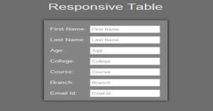
Create A Full Responsive Table Using HTML And CSS
Last Updated : Jul 1, 2023
In this tutorial we will help you to create a Full Responsive Table with the help of HTML and CSS, Tables are important part of HTML when it comes to arrange data but nowadays, tables are less used to arrange data due to there unresponsive layout.
You may also like pricing table using HTML and CSS.

CHECK OUT THIS TUTORIAL LIVE DEMO →
To Create a Full Responsive Table It Takes Only Two Steps:-
- Make a HTML file and define markups for Table
- Make a CSS file and define styling for Table
Step 1. Make a HTML file and define markups for Table
We make a HTML file and save it with a name table.html
<html>
<head>
<meta name="viewport" content="width=device-width,initial-scale=1.0,maximum-scale=1.0" />
<link rel="stylesheet" type="text/css" href="table_style.css">
</head>

<body>

<p>Responsive Table</p>
<table align=center cellspacing=10>
 <th class="hidden_th">First Name:</th>
 <tr>
  <td class="column1">First Name:</td>
  <td><input type="text" placeholder="First Name"></td>
 </tr>

 <th class="hidden_th">Last Name:</th>
 <tr>
  <td class="column1">Last Name:</td>
  <td><input type="text" placeholder="Last Name"></td>
 </tr>

 <th class="hidden_th">Age:</th>
 <tr>
  <td class="column1">Age:</td>
  <td><input type="text" placeholder="Age"></td>
 </tr>

 <th class="hidden_th">College:</th>
 <tr>
  <td class="column1">College:</td>
  <td><input type="text" placeholder="College"></td>
 </tr>

 <th class="hidden_th">Course:</th>
 <tr>
  <td class="column1">Course:</td>
  <td><input type="text" placeholder="Course"></td>
 </tr>

 <th class="hidden_th">Branch:</th>
 <tr>
  <td class="column1">Branch:</td>
  <td><input type="text" placeholder="Branch"></td>
 </tr>

 <th class="hidden_th">Email Id:</th>
 <tr>
  <td class="column1">Email Id:</td>
  <td><input type="text" placeholder="Email Id"></td>
 </tr>

</table>

</body>
</html>
Step 2. Make a CSS file and define styling For Table
In this step we make a CSS file and save it with a name table_style.css and define style for our Table for devices screen sizes starting from 180px.
We use CSS Media Query to define styling for different screen sizes.You may also like expand table rows using jQuery.
This is the default style when our Web page is not viewed on our defined screen sizes.
body
{
 background-color:#6E6E6E;
 font-family:helvetica;
}
body p
{
 text-align:center;
 margin-top:30px;
 font-size:40px;
 color:#E6E6E6;
}
table
{
 border-radius:3px;
 box-shadow:0px 0px 10px 0px;
 padding:10px;
 background-color:#848484;
}
table td
{
 font-size:20px;
 color:#E6E6E6;
}
table th
{
 visibility:hidden;
 display:none;
}
input[type="text"]
{
 width:200px;
 height:35px;
 border:1px solid silver;
 border-radius:3px;
 font-size:17px;
 padding:5px;
}
This style is for screen size having minimum width of 180px and maximum width of 679px.
@media only screen and (min-width:180px) and (max-width:679px)
{
table
{
 width:100%;
}
table .column1
{
 visibility:hidden;
 display:none;
}
table th
{
 visibility:visible;
 display:block;
 font-size:20px;
 color:#E6E6E6;
}
input[type="text"]
{
 width:80%;
 margin-left:10%;
}
}
In this step we hide table column having class column1 and show our table header <th> to make our table responsive for every layout. You may also like show hide table column using JavaScript.
Thats all, this is how to create a Full Responsive Table using HTML and CSS. You can customize this code further as per your requirement. And please feel free to give comments on this tutorial.
I hope this tutorial on responsive table css helps you and the steps and method mentioned above are easy to follow and implement.
 About Ashish
Ashish is a dynamic and motivated individual with a passion of programming and an experienced programmer having 3+ years of experience in various languages like Java, Python, HTML, CSS, JavaScript, jQuery and various frameworks like Bootstrap
RELATED TUTORIALS
 Create A Full Responsive Table Using HTML And CSS
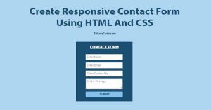 Create Responsive Contact Form Using HTML And CSS
 Full Page Background Image Using HTML And CSS
 Create Simple Responsive Navigation Menu Using CSS
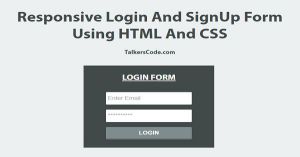 Responsive Login And Signup Form Using HTML And CSS
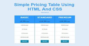 Simple Pricing Table Using HTML And CSS
 Expand Table Rows Using jQuery, HTML And CSS
 Simple And Best Responsive Web Design Using CSS
- Simple And Best Responsive Web Design Using CSS Part 2
 Sort Table Using jQuery